HEFCE HE Grant Allocations 2009-10 Visualised

In our weekly team meeting, I mentioned that I’d created some visualisations of the RAE research funding allocations. I also mentioned that Tony Hirst had previously done the same for the HEFCE teaching funding allocations. I offered to send everyone links to these, but before do so, I thought I’d have a go at re-creating the HEFCE visualisations myself to get a bit more practice in with IBM’s Many Eyes Wikified. So this is a companion piece to my previous post. All credit to Tony for opening my eyes to this stuff.

So, HEFCE have announced the 2009/10 grant allocations for UK Higher and Further Education institutions and provided full spreadsheets of the figures. I’ve imported the data into Google Spreadsheets and made the three tables publicly accessible as CSV files (1), (2), (3). Note that I’ve stripped out all data relating to FE grant allocations, which is included in the original spreadsheets.

Next, I’ve imported the CSV files into IBM’s Many Eyes Wikified (1), (2), (3), and these wikified tables are now the data sources for the following visualisations.

Recurrent grant for academic year 2009-10

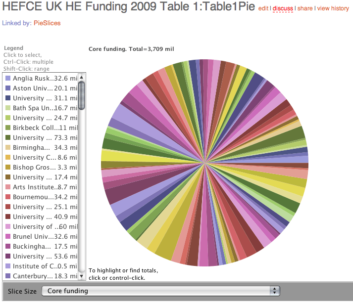
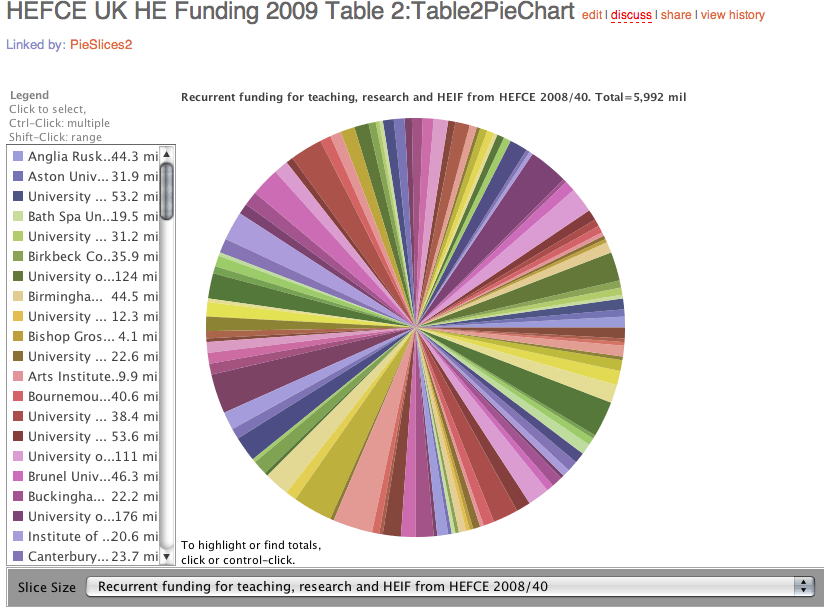
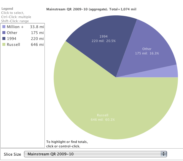
The Pie

Pie Chart of HEFCE Funding

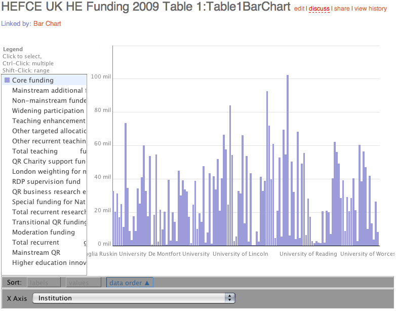
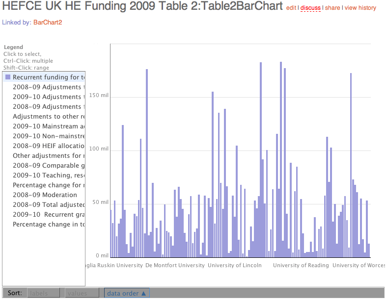
Bar Chart

HEFCE Funding Bar Chart

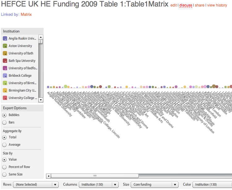
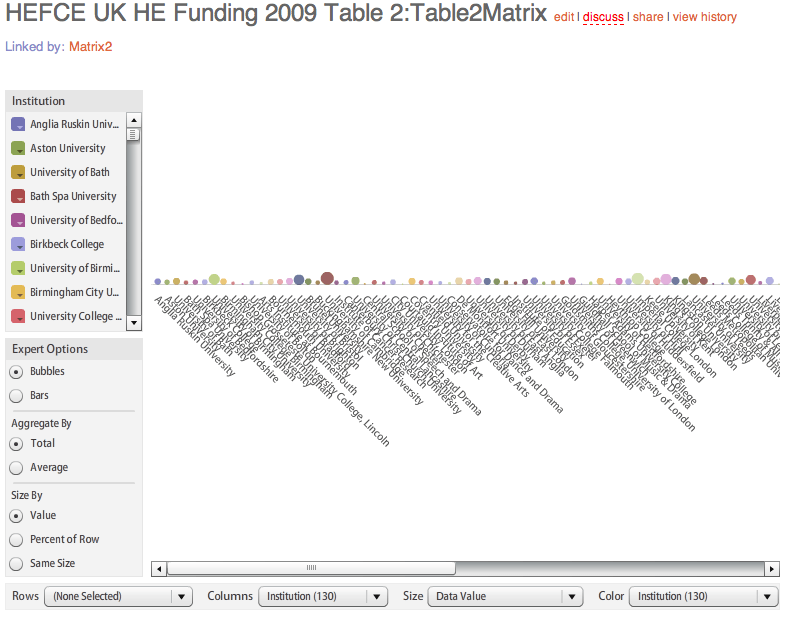
Matrix

HEFCE Funding Matrix

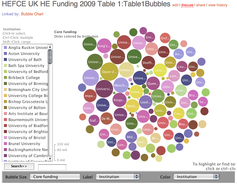
Bubble Chart

HEFCE Funding Bubble Chart

Comparison with 2008-09 academic year recurrent grant

The Pie
HEFCE Recurrent Funding Pie ChartBar Chart

HEFCE Recurrent Funding Bar ChartMatrix

HEFCE Recurrent Funding MatrixBubble

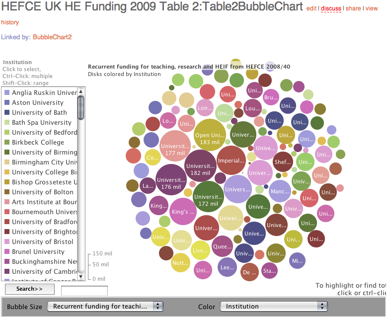
HEFCE Recurrent Funding Bubble ChartNon-recurrent funding for 2009-10

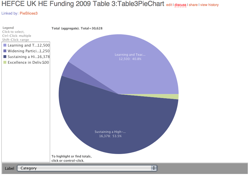
The Pie

HEFCE Non-recurrent Funding Pie Chart

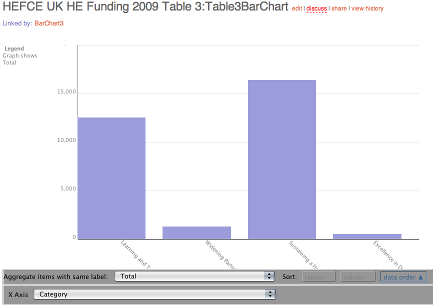
Bar Chart

HEFCE Non-recurrent Funding Bar Chart

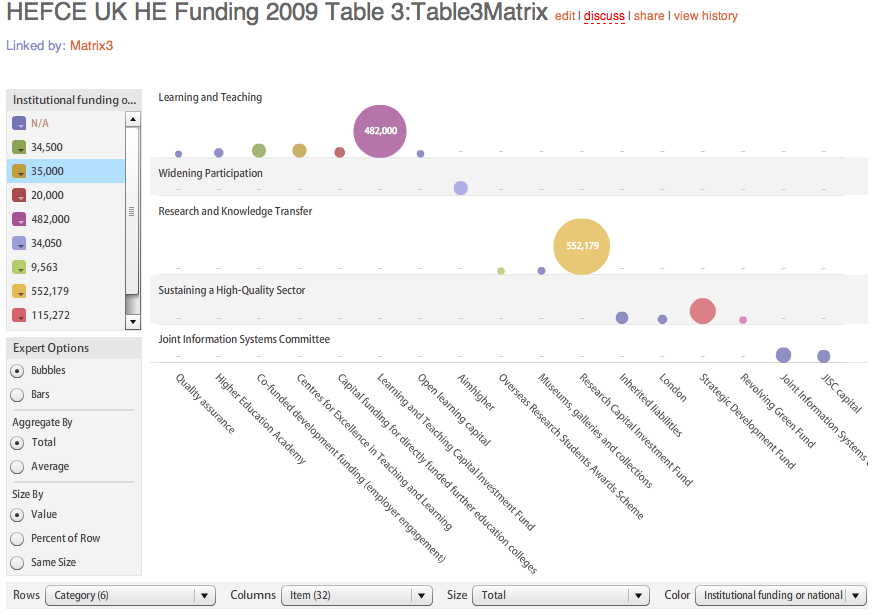
Matrix

HEFCE Non-recurrent Funding Matrix

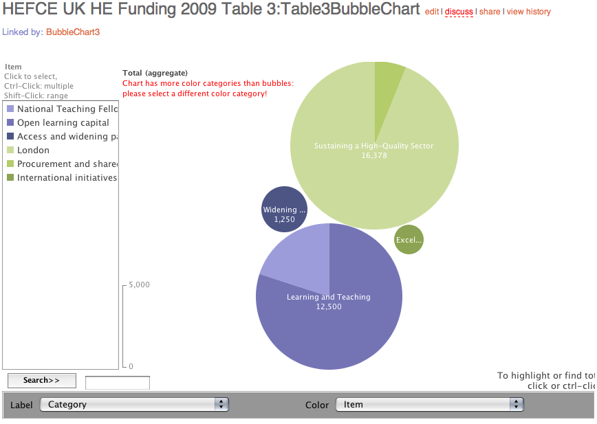
Bubble ChartHEFCE Non-recurrent Funding

RAE: UK research funding results visualised

Yesterday, the results of the funding allocation for research in UK Higher Education were announced and published on the Times Higher Education website.

Successive RAEs have concentrated research cash in the hands of the elite. This time around, the pie has been shared more widely.

The full spreadsheet of results being available, I thought this was a good opportunity for someone to visualise the data, so I published the data on Google Docs as a CSV file, which Tony Hirst fed into IBM’s Many Eyes wiki and now we can really see how the pie has been shared. Click on the images to view the interactive visualisations.

A pie…

RAE Funding Pie
Funding allocation by university group

Some bubbles…

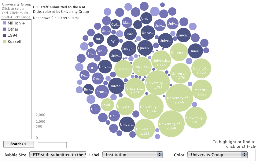
FTE staff submitted to RAE by institution and coloured by group

A bar chart…

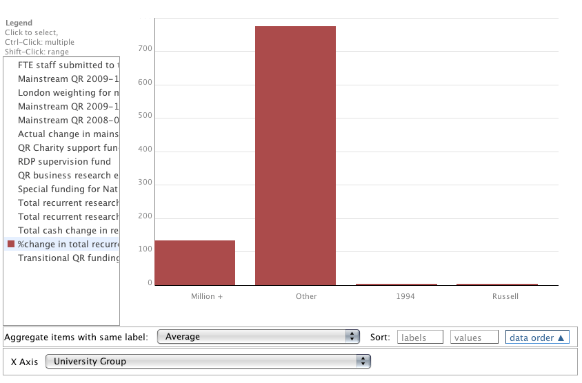
% change in total recurrent research funding
% change in total recurrent research funding by group

and a matrix…

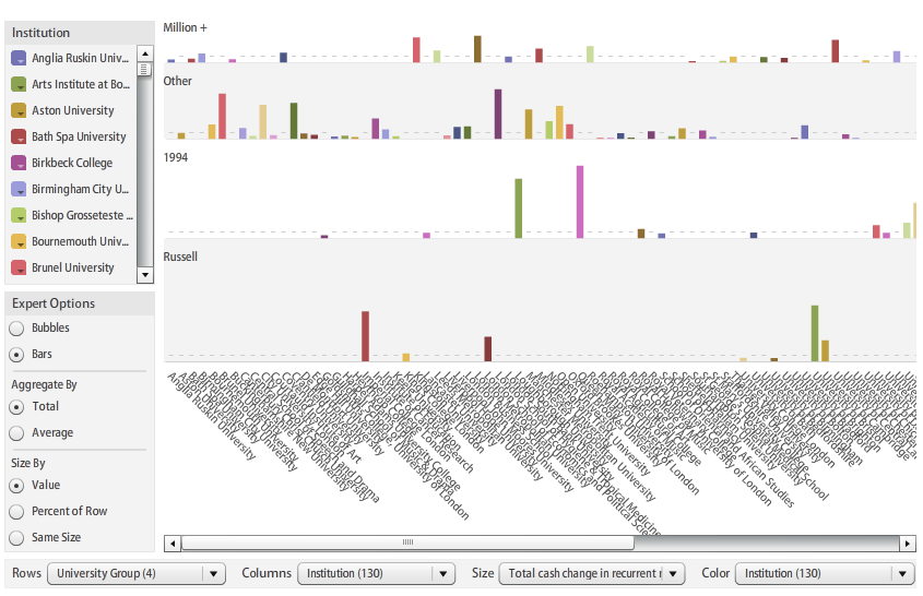
Cash change in funding by institution and group

You can read about the University of Lincoln’s 628% increase in funding, here and here.