Yesterday, the results of the funding allocation for research in UK Higher Education were announced and published on the Times Higher Education website.
Successive RAEs have concentrated research cash in the hands of the elite. This time around, the pie has been shared more widely.
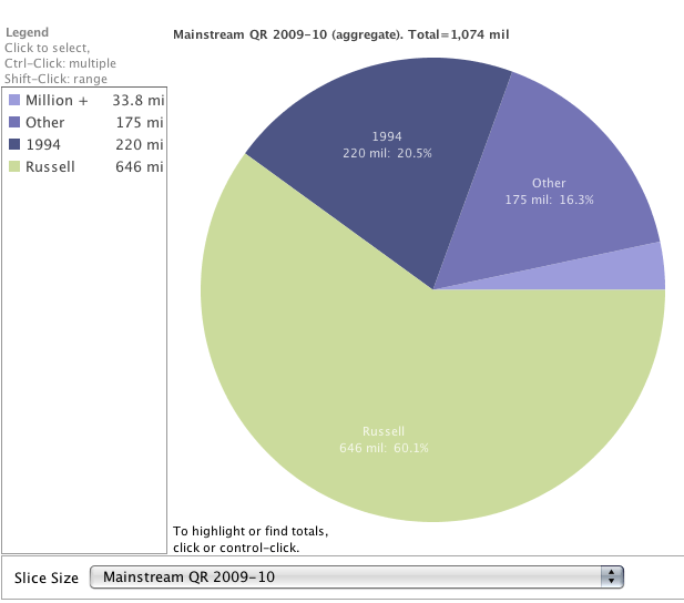
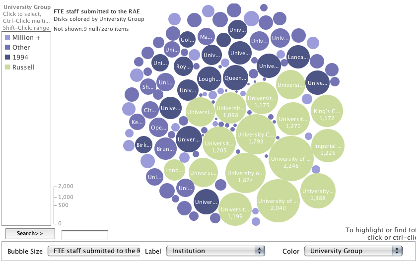
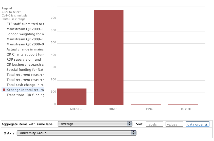
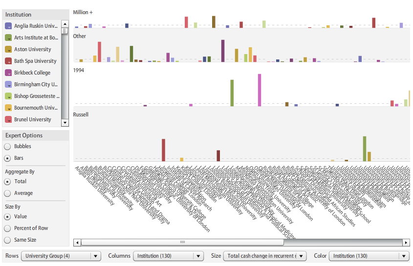
The full spreadsheet of results being available, I thought this was a good opportunity for someone to visualise the data, so I published the data on Google Docs as a CSV file, which Tony Hirst fed into IBM’s Many Eyes wiki and now we can really see how the pie has been shared. Click on the images to view the interactive visualisations.
A pie…

Some bubbles…

A bar chart…

and a matrix…

You can read about the University of Lincoln’s 628% increase in funding, here and here.