Two weeks with a Kindle 3

I have a Kindle 3 (wifi only). Here’s what I think about it after two weeks. I should say that I have absolutely no interest in reading eBooks bought from Amazon on it. What interests me is the ability to read newspapers and academic articles on it.

+ Size, weight and general form are good. Feels nice to hold. I also have the leather case for it, but it doubles the weight and is awkward to hold so I only use it when the Kindle is shoved into my bag.

+ The screen is excellent for reading text in the .mobi and native amazon format. I appreciate the ability to change the font size more than I imagined I would and have found myself wishing that I could change the font size on print books now. The screen appears sharper the more light that is shining on it (i.e. daylight) but is unreadable in poor light/darkness (much like a book).

– Despite the screen being the main strength of the Kindle, looking at a grey scale screen still feels like a distinct step backwards. I’m reminded of using my mid-90s laptop. Page turns/screen refreshes are about as fast as turning a page in a print book, which sounds satisfactory but the experience is all wrong. Page turns are clearly visible screen refreshes/flashes.

– The speed of the device feels retrograde. My touch screen phone feels faster despite having roughly the same 500MHz processor speed.

+ Having said that, from an engineering point of view, the device is apparently a thing of beauty. I can appreciate that.

– The screen is poor for reading A4 sized PDF files. It’s just not big enough and the font on a full page view is too small. On landscape mode, it is better but requires lots of button pressing to scroll through the text and is generally not worth the bother because…

+ You can email .doc and .pdf files (and other text formats) to your @kindle.com or @free.kindle.com email address and Amazon will immediately send you a nicely formatted conversion of the PDF to your device.

+ Feedbooks is a nice way to get out of copyright (i.e. classics) books on the Kindle for free.

– All content is homogenized to become ‘Kindle Content’. Newspapers, books, articles, whatever they originally might have looked like, become the same standardised text on the screen, surrounded by a dull graphite border. I tried to tell myself that it strips away the fluff to reveal the true essence of the book/newspaper/article, but I find the experience of reading otherwise creatively designed content (i.e. a newspaper) on the Kindle quite dispiriting. Even images become washed out and gray. Thankfully, for academic papers, it doesn’t matter so much because they tend to include little more than text in the first place.

+ The battery life is excellent. Over a week with wifi turned on all the time. Apparently a month if turned off, but that’s not how I use it.

– The 3.0 software was very unstable and the device froze regularly. However…

+ The 3.0.1 software upgrade fixes any software issues I experienced.

-/+ The browser is OK. Mobile sites are bearable. I would usually choose using my touch screen phone to browse the web over the Kindle. Web browsing on a slow device with a black and white screen isn’t much fun. However, the ‘Article Mode’ option, which is based on the same idea as Readability, is a nice touch and makes reading a long article a pleasure. Better than using my phone or my laptop or PC. I was already in the habit of saving long print view versions of articles on the web to PDF for reading and now I can email them to my Kindle to read or browse to the web page on the Kindle itself.

-/+ The keyboard is OK. I wish there were keys for numbers. Initially I found the keyboard awkward and navigation around the device and content, a hassle. I’ve got used to it and it’s beginning to make sense to me now. It’s no match for touch screen navigation on the iPhone or Android phones though. The keyboard buttons make a noise so it’s irritating if you’re in a quiet room (i.e. reading in bed with your partner).

– It’s linked to my Amazon account and so it’s yet another device I have to password protect.  I hate the fact that I have to login to the device just to read something.

– The annotation and sharing features are very basic. You can make notes on selected text using the fiddly keyboard but it’s no match whatsoever for the convenience of scribbling in the margins with a pencil. Sharing to Twitter simply tweets a note and link to some selected text on an Amazon web page. I would much prefer a ‘share by email’ feature, like I have on my phone, so I could send myself or others, annotated text by email.

– I wish I had the 3G version. There are times when logging into wifi or having no wifi at all is a minor inconvenience. I thought I’d be able to tether it to my phone but the Kindle wifi won’t work with enterprise/P2P wifi networks. Given the cost, I would trade the leather case for the addition of 3G.

+ Calibre is a fantastic bit of open source software for creating newspapers and delivering them to your device. I have it set up so that my laptop at home wakes at 6am, opens Calibre, downloads three newspapers and sends them to my Kindle ready for when I wake up at 6.30ish. The papers are nicely formatted, with images, and easy to read on the way to work. This somewhat makes up for the complaint about homogenized content I mentioned above. You can pay for Amazon to deliver newspapers to you, too, but by most accounts I’ve seen, they are poorly presented and expensive compared to the print editions. Why bother when Calibre does it for you (and much more)?

– I haven’t used the text-to-speech feature yet. The music player on it is very basic. It’s like using an iPod Shuffle. Stop, start, forward, backwards.

– Already having a smart phone, iPod Touch, home laptop, work laptop and work desktop, the Kindle is an improvement in some areas (straight forward reading of natively formatted text), but is yet another device to throw in my bag. I was sat at a conference recently with my phone, laptop and Kindle all at hand, feeling like a bit of an idiot.
ePub downloads from EPrints

I’m at JISC’s #dev8D conference. There’s no end of developer challenges but I’m not a developer. Still, here’s an idea that maybe someone will pick up and run with:

The use of eBook readers is on the rise. Anyone with an iPhone, Android phone, as well as Kindles and Sony Readers, has an eBook reader.

Institutional Repositories provide scholarly articles in PDF format, which eBook readers don’t handle very well at all, especially the phone versions.

Why not provide a Word-to-PDF conversion facility in your repository? EPrints currently offers Word-to-PDF conversion durinng the deposit process. Why not Word-to-ePub format, too?

Why not provide an ePub file as an alternative to the PDF download? ePub is a free, open, standards-based (XHTML/CSS) file format for eBook Readers. There are many advantages for the reader to having an ePub version rather than a PDF version when using an e-Book reader. i.e. better page navigation, search, bookmarks, variable font sizing.

There are PDF-to-ePub converters on the web, so technically it’s possible. They are  a bit hit and miss, but so are the Word-to-PDF converters.

Anyone interested? I’d be keen to help if required.

Pencils and Pixels: Publishing OERs using WordPress (and EPrints)

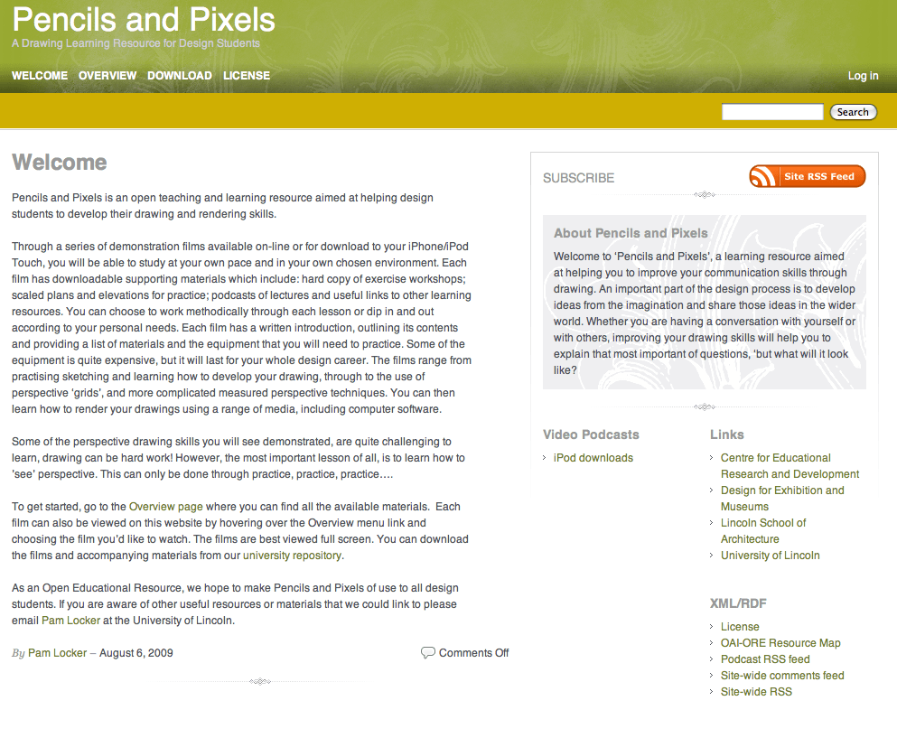
I’ve spent much of today trying to finish off a site for anyone interested in learning how to sketch.  Pam Locker, a Principle Teaching Fellow and lecturer on the Design for Exhibitions and Museums degree, had produced (with her colleagues) ten, good quality videos on learning how to sketch and wanted to make them widely available. We discussed Creative Commons licensing and how we might publish them on the web and, well, this is what I’ve ended up with… For me, it’s a kind of rehearsal for the HEA/JISC-funded Chemistry.fm project.

[As I write, I’ve still got to upload a couple of videos and podcasts, but it’s complete enough to discuss here].

Pencils and Pixels

http://pencilsandpixels.blogs.lincoln.ac.uk/

All the original materials are in our Institutional Repository (IR). <– that’s the direct link which you might want to have a squint at. Although the IR transcodes video for preview on the web, we weren’t satisfied with the quality of the web versions for display on the WordPress site. Due to the nature of the content, it’s important to be able to see considerable detail on the screen and so we looked around for third-party hosting that would accept 50 mins+ videos at 2Mbps each. I ended up opting for a Vimeo Pro account.

So, at this point, we have all the original source materials in the IR, as well as copies of the high quality videos on Vimeo which we could use to embed on a WordPress site. From the IR, you can preview and download the videos as well as download all the accompanying support materials as a .zip file.

The WordPress site consists of fourteen pages. One Overview page, is a parent page for all ten videos and their related resources. It’s basically a map of resources linking to the individual files in the IR. There’s also a License page and a page with information on how to Download all the OERs. In addition to the license page, I’ve added the CC license code to the theme footer. This could have been achieved with a plugin but I just hard coded it in the theme. The site also has the Dublin Core for WordPress plugin (actually, it’s activated across all blogs on our WPMU platform – hell, why not!) and the OAI-ORE plugin for WordPress is activated, too. I wrote about these plugins recently and following a comment from Andy Powell, updated the DC4WP plugin to reflect current standards.

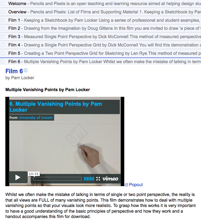
Because much of the content is constructed using WordPress pages and not posts, I also used the RSS includes pages plugin, which does exactly that. Then, I adjusted the publish dates of all the pages so that they are included in the RSS feed in the right order.  Actually, ‘right order’ is questionable here. I’ve opted to publish them backwards so that when someone subscribes to the feed they get the course dumped in their reader in one go, with the first video first. By default, they would be in reverse order and I guess Tony Hirst would say that’s a better way of doing it and I should use his daily feed plugin to drip feed the OERs. Ack! I dunno. Personally, I like the way you can click on the feed and get the entire resource ordered correctly in Google Reader 🙂 Go on, tell me what I should do…

OERs in Google Reader

In addition to the embedded video, I also created versions of the videos for the iPhone/iPod Touch. I used WordPress posts for this because you can add categories to posts and from the category, you get a nice feed which can be subscribed to separately from the main feed (which also includes the video podcasts). I added a clearly visible link to the video podcasts on the front page and a link on the Download page.  The main feed and the podcast feed are both auto-discoverable.

As well as these feeds, I also created an XML/RDF block of links in the sidebar to advertise to geeks the OAI-ORE Atom resource map and other stuff. A bit pointless, but you might like to have a look.

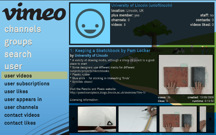
I also thought that it might be nice to watch the videos using Boxee. The site RSS feed doesn’t really work (you can’t control the embedded video), but there’s a Vimeo app for Boxee that can be used to subscribe to any particular user’s videos. This works nicely, although if I start using the account for other, unrelated videos, it’s going to get cluttered. I guess you could run a search for ‘Pencils and Pixels’ which would only pick up the videos we want. I need to think about Boxee and other broadcasting applications a bit more. I’d be interested to know how you might have approached this project differently.

Pencils and Pixels on Boxee

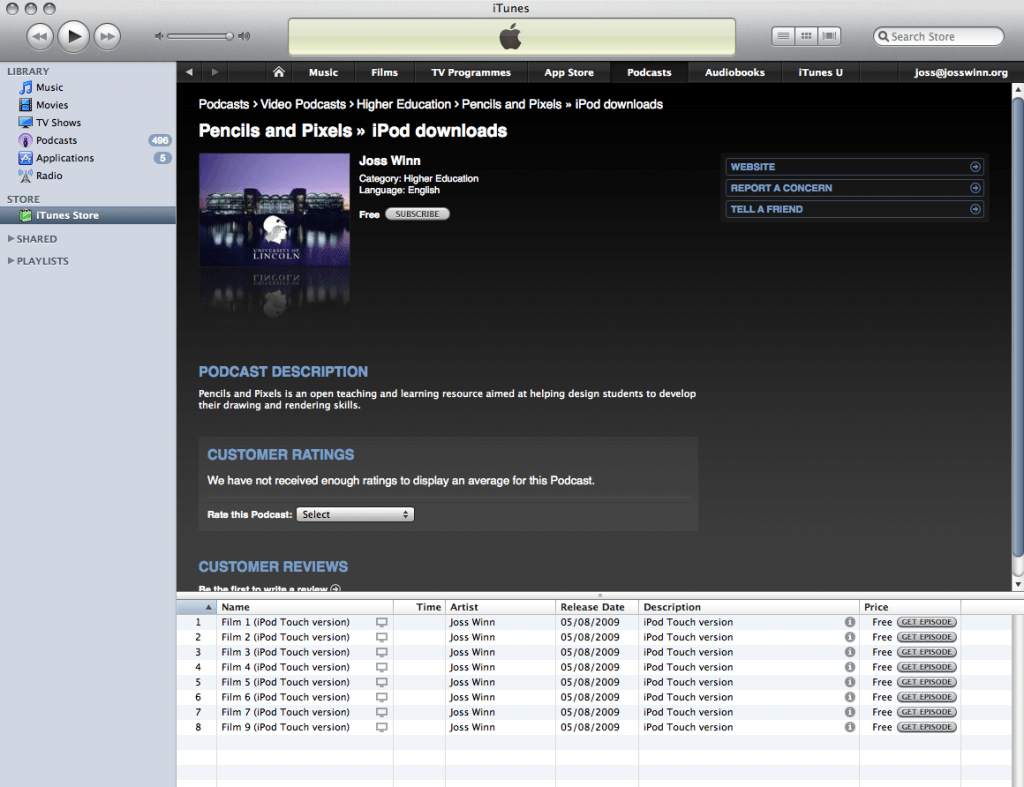
UPDATE: I forgot to add (maybe because it’s just so trivial with WordPress), that the Pencils and Pixels site also has the Media RSS and WPtouch plugins activated. It will look really nice on your iPhone, Android, Blackberry and maybe other phones, too. The MediaRSS plugin should allow me to embed media in the RSS feed. I wonder whether it can improve the Podcast feed but I think that by default, it’s only set up to work on images. I’ll work on it. I’ve also used FeedBurner to enhance the podcast feed. The nice thing about this is that you can quickly prepare the feed for submitting to iTunes, which I’ve done and it should appear in the next few days. A direct download link for iTunes is here 😉 UPDATE: Here is the approved iTunes link.

iTunes